I hope you’re ready for the Wild West, because it’s back.
Apart from some specific thinking about inflation and interest rates in the first half of 2024, this blog has remained pretty quiet regarding where I think the US economy is headed under a second Trump term. No longer. This blog will cover the economy as it’s performed over the last several years, and future blogs will go into what Trump has said he wants to change, and where I think we’re headed.
I will try to keep things as data-dependent and non-political as I can. However, I will be honest with you regarding what I believe. The line between politics and economics has blurred significantly, which we will get into, and several indicators have been corrupted beyond reasonable repair. Nonetheless, we will push through. For this current edition, we will stay on message.
The Backdrop
As usual on this website, we start with inflation.
After the 2008 financial crisis and subsequent regulation, the Fed set an inflation target of 2.0% PCE. PCE meaning Personal Consumption Expenditure, a measure of how much the consumer is actually spending on stuff, tracked by surveys of businesses’ incomes. This differs from CPI, Consumer Price Inflation, which simply tracks the change in prices of goods over a period of time, without factoring in what people are actually paying. Because of this difference, CPI is almost always a bit higher than PCE. But for our purposes today since CPI is much more widely accepted among non-economists, we will be using CPI. The picture below illustrates the difference between the two in the last few years.

The picture tells the whole story regarding inflation. The Fed set its 2% PCE target in 2012, and never achieved it in the post-2008 economy. Then Covid happened, and inflation got a lot more volatile. As people were locked down and supply bottlenecks prevented goods from coming into the country, inflation dipped toward zero, and then when the economy opened up again, people spent money like there was no tomorrow. Inflation rocketed up toward highs not seen in decades. CPI peaked at just above 9% in the middle of 2022, and as supply pressures eased (the port backlogs cleared, and people went back to work, for example) inflation eased along with it. We still have elevated consumer spending levels compared with 2019, and wages have continued to rise at a faster clip (more on this later), so CPI has settled out around 2.5% – 3%.
Contrary to everything you might have heard, this does not mean recession.
But the Fed responds to inflationary pressures by raising interest rates and tightening the money supply. And due to the unique nature of a global pandemic shutting down economies, followed by their rapid reopening, even the Fed had to adjust what it does in a quicker time than it likes to. You may have heard me say that the Fed has a three-step process for doing things; first they “talk about talking about” doing something (to ease market participants into it), then they talk about it, then they do it. Everything is usually well choreographed in advance. Not so much this time.
There were two major ways the Fed responded to the Covid and Post-Covid economy. You can think of the first as managing short-term interest rates, and the second as managing long-term interest rates. Through these tools, the Fed has indirect, although material, control over the entire rate curve.
The first is through setting overnight interest rates. The Fed sets the benchmark overnight lending rate, the Fed Funds Rate (FFR), in a range that conveys overnight bank borrowing from both the Fed and from other banks. Starting in 2015, the Fed slowly raised the FFR from its post-crisis low of 0%-0.25% up to 2%-2.25%, reflecting the normalization of financial conditions. After a couple “mid-cycle adjustments” to use Jay Powell’s words, in 2019 the FFR was trimmed to 1.5%-1.75%, but when Covid hit in early 2020, the rate was lowered back down to its crisis low at the effective zero-bound. And there it stayed for about two years, until the Fed saw inflation starting to spike to its high and began rapidly raising the rate up to its new high of 5%-5.25%. This helped stabilize inflation (the extent to which this is true is still very much a debate!) and the Fed has in the last few months started to once again lower it to a more normal level. The FFR currently sits at 4.25%-4.5%. The picture below shows the effective FFR, a balance between the two points in its range, in this time frame.

Overnight lending is a benchmark figure that affects short-term lending rates, such as revolving credit card rates and auto loans. In a normal interest rate environment, the lowest interest rate is the overnight rate, because if you lend your money overnight, you expect it to be repaid the following day, so your time risk is minimal. All other interest rates for longer lengths of time are supposed to be higher than this rate, because your time premium would be higher, and thus you have less of a chance of receiving your money back.
The other method by which the Fed acts is through its Balance Sheet. Prior to 2008, this was not a tool the Fed relied upon in its toolbox, as private-sector financial institutions did a good enough job of managing the money supply, such that the Fed did not need to do much management of its own. However, in 2008-2009 that all fell apart, as those institutions could no longer be trusted to act in society’s best interest and turned out to be cheapskate frauds gambling with our money on clearly toxic assets. The Fed, as the Buyer Of Last Resort, had to onboard those toxic assets, mostly mortgages and mortgage-backed securities, onto its own balance sheet, both to limit the supply of long-term bonds on the market, and to tamp down on long-term interest rates. Since the Financial Crisis, the Balance Sheet has been a primary tool the Fed uses to influence the long tail of the rate curve.
From 2009 to 2013, the Fed’s Quantitative Easing measures brought its balance sheet up from under $1 Trillion to about $4.5T. In 2015, coupled with its raising of interest rates, it began to roll-off existing bonds on the balance sheet, meaning once those bonds expired, it wouldn’t reinvest that money into more bonds. This lowered the balance sheet to under $4T, but as the economy has begun to rely on the additional liquidity the Fed provided through its balance sheet, financial conditions got tight enough in 2019 where they had to stop rolling off their assets, and lower interest rates a bit (mentioned above) to stabilize things. Then Covid hit, and the Fed rapidly began buying treasury and mortgage bonds in another effort to stabilize long-term rates and get people to borrow again, on things like real estate. The balance sheet ballooned to just south of $9T in mid-2022, when coupled with inflation peaking and starting to decrease, the Fed once again began rolling off assets in the balance sheet. After a small hiccup related to 2023 excessively-risk-taking bank closures (Silicon Valley Bank and other crypto institutions), rolling off has held steady this time around, and the balance sheet currently stands at $6.85T. I suspect the Fed will stop once it comes close to the post-crisis high, though this may take many more years.
The picture below illustrates the Fed’s Balance Sheet levels in this time frame.
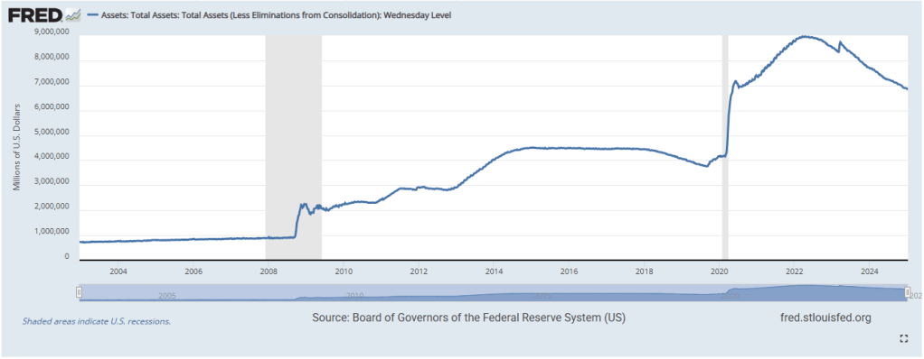
Before we move on, I would like to make special mention of that 90 degree slope during Covid in 2020. That was not the Fed buying assets. That rapid increase was due to the definition of the M1 money supply changing. Before May 2020, the M1 money supply measure tracked currency in circulation plus checking account balances. In May 2020, that was expanded to include savings account balances as well. Because many businesses and banks maintain savings account balances at the Fed, some with very high amounts, those became included in the Fed’s balance sheet. This was not due to federal spending on things like the CARES Act. That all came after, and you can see it coming after in the picture.
So financial conditions have been loose, and then tight, and now perhaps getting loose again. How has that translated into the average person’s life?
As you can imagine, Covid did a number on the job market. What you might not realize is the speed at which it’s recovered, and improved, since 2020.
It should be no surprise to (re)discover that starting in February 2020. lockdowns threw a lot of people out of work. The picture below illustrates the speed at which this happened. More people were affected than were during the 2008 crisis, and at frightening speed. Due to the nature of the pandemic, this disproportionately affected service-sector and lower-income people. But almost as quickly as they lost their jobs, typically put on furlough, all the jobs lost were regained in less than two years. This is practically unheard of in the realm of economic crisis response.

The above picture begins around 2005. You’ll notice the steep slope up during 2008-2010 as the financial crisis ravaged the economy, followed by a slow gentle descent back down. This was a reflection of the Obama administration and the prevailing bipartisan consensus at the time, in how to deal with financial crises. 2008 was a demand-driven crisis, so the response was comparably austere, and those in charge did not want to risk stoking high inflation as a trade-off for broader fiscal spending. We were also afraid of trillion dollar deficits beck then, a fear that’s been totally thrown out the window today. As a result, the private sector was left to fend for itself, so to speak, and recovered far more slowly.
When Covid happened in 2020, the Fed and the Government both had learned their lesson not to let the recovery period last too long with too small a result, and decided to swing hard in the other direction. Think of the Three Little Pigs. First, they blew too gently, and the house did not fall down, so now they blew too hard, and maybe it fell down too fast. Seeing the historically low period of inflation that followed 2008, and seeing a different crisis in 2020, a supply-driven crisis, the decision was made to spend, and spend a lot. Stimulus checks were mailed directly to every eligible American, and could be claimed as refundable tax credits. Massive fiscal spending programs like the CARES Act and the Paycheck Protection Program, coupled with the Fed offering direct lending to state & local governments, buying publicly traded bond funds to support borrowing, and expanding its balance sheet (shown above), offered so much support that the unemployment rate rapidly dropped almost as fast as it rose, as hiring resumed, the economy reopened, and people got back to work.
We generally consider an unemployment rate of 4%-5% to be full employment, because almost everybody who wants a job has one, and the extra “slack” allows for businesses to hire and fire and for people to quit and find other jobs. You don’t want an unemployment rate of 0% because that means nobody can leave their jobs, and you don’t want a rate much higher than 5% because that means nobody can find jobs. The college student that can only work during the summer, would be screwed in either latter scenario, for example.
So people got back to work relatively quickly compared with past crises. But are they making more money compared with before Covid?
Yes, yes they are. Nobody wants to admit they are, as that would break the doomist narrative that’s engulfed this country, but they are.
The two pictures below show changes in Real Median Weekly Earnings for workers aged 16 and older, by quarter. The first shows the absolute value of those wages indexed to 1982 dollars, where Q1 2017 wages are $350/week. The second shows the rate of change per quarter from the previous year, meaning Q1 2018 is compared to Q1 2017. They show a little before 2020, and from Covid until now. Real, meaning inflation-adjusted, Median, meaning the middle person in our 336-million strong nation. These numbers are not skewed by the ultra-rich. These are the actual numbers that pertain to normal people.


Remember reading that pandemic shutdowns disproportionately affected lower-income folks? Well that big spike in mid 2020 was not due to the rich getting bailed out by the government. When tens of millions of low-income workers fall out of the labor force, and thus fall out of income calculations, that causes a Composition Effect that means that higher incomes are now disproportionately weighted. As a result, there was a huge spike in incomes during the pandemic, followed by a just as quick fall back down. Then, as lower-paying jobs came back during the reopening, the inverse happened, and the calculation began to skew toward the negative; things balanced out.
This is an example of national statistical data being misleading! We must always be mindful not just of the data, but what the data is telling us.
Moving forward in time, incomes fell in real terms during 2021 and most of 2022 as inflation rose and peaked. But as inflation fell back to normal and incomes continued rising, that negative trend turned positive. Real wages have been growing since the end of 2022, for over two full years, and are indeed now positive for some time since before Covid hit. The complaint about inflation eating away at your purchasing power was a well-founded one a few years ago, but not so much anymore.
Here’s the same two pictures, but showing nominal wage growth in the same time frame, using non-inflation-adjusted dollars. This separate calculation shows how much wages grow every single year, irrespective of the inflation rate. Before 2020, wages were rising by about 2.5%-3% per year, which did indeed beat the sub-2% inflation of the time, but still was not fast. After Covid hit and the stimulus that followed, wages started to rise at above 4%, and have continued to rise at about that rate, from 2020 until today. Every month that inflation stays at its normal range and wages remain elevated, is a month that workers are winning.
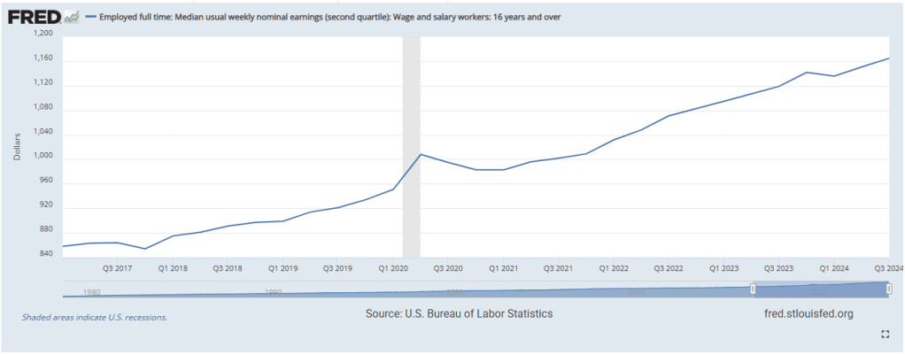

A lot of what’s been driving the elevated wage growth came from the “Great Resignation” back in 2021-2022, when Covid caused a lot of people to reevaluate what they wanted out of their lives and their jobs. Millions of older workers decided to retire, and even more younger workers decided to hop to better paying jobs. This caused the Quits Rate (the amount of the workforce quitting their jobs) to rise from its range of about 1.8%-2% before 2020 to 3.0% in 2022. We’re talking about a labor force of over 150 million people, so 1% is quite a lot! It’s fallen back down to its historical range, but the effects are still being felt. When companies have workers leave for greener pastures, well, they have to make their own pastures greener, so they will usually offer more pay or benefits to attract workers back. They don’t want to do this, and they won’t unless they’re forced to, but this is how labor markets work! It’s good that so many people took advantage.
One probable downside to the last few years is the decrease in the Labor Force Participation Rate. This is calculated by taking the number of people working, divided by the total civilian non-institutional population (basically, everyone old enough to work, minus prisoners). Various factors, from the poor responses of crises past to our aging population, have caused this rate to steadily decrease in the 21st century, and the past few years were no different. The LFPR was around 63.3% before Covid, dropped sharply to less than 60% during the crash, and has recovered to about 62.6% today. I think we can expect this to continue decreasing, as more of our seniors leave the labor force, and even as AI comes in to automate some existing jobs. Whether that’s good or bad, I’ll leave up to you to decide for yourself.
Finally, even though I’m sure I care about it much less than you do, we should cover the Big Fiscal stuff. GDP and the National Debt.
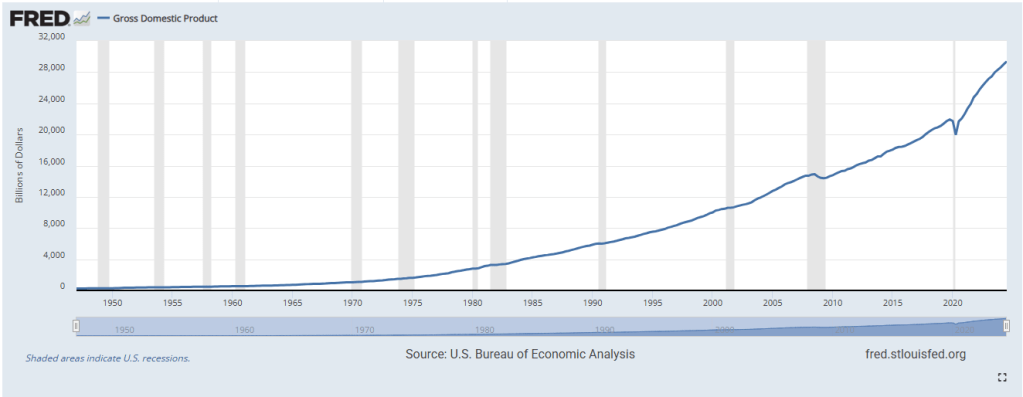
Prior to 2008, and the novel changes in how America and the Fed responded to financial crises, deficits were a lot lower. As I mentioned above, we were afraid of huge deficits, and back then, a trillion dollars was considered massive, universe-level. Of course, since then, our GDP has grown so much that several individual companies are now worth more than a trillion dollars. You can probably think of some. For better or for worse, this is what growth entails, larger and larger numbers.
Here’s a picture of our GDP since the Fed began tracking it, in billions of dollars. You can see the ever upward sloping growth rate through various decades leading up to 2008, the less-sloped growth from 2008 to 2020, and then the much higher-sloped growth since Covid. It’s a testament to our monetary and fiscal lessons learned that enabled this growth. America is the envy of the world, economically speaking, that was true before Covid but it’s definitely true now.
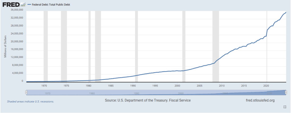
Naturally, being a fractional reserve, debt-based economy that manages in a Keynesian way, we operate on debts. It’s very important that we have a solid and growing tax base! That shows other nations that we will always pay our debts. But at the same time, we operate on debts. And our national debt has indeed been climbing at a sizable clip since 2008. As you can see in the picture below, our total public debt currently sits at about $36 Trillion. This includes State & Local debt.
This picture shows our annual federal deficits, in millions of dollars. As I mentioned above, before 2008, we were scared of massive annual deficits ballooning our national debt to the point where the world wouldn’t want to lend us money anymore. That ship has long since sailed, and annual deficits almost always eclipse the trillion dollar mark now. This is a bipartisan trend, and neither one party is responsible. We’re truly on this ship together, but it might not be sinking like you’d expect.
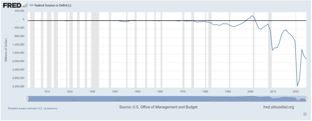
As the old sports adage goes, the best defense is a good offense. Applied here, the best way to avoid worrying about large debts is to keep growth high. America is the spending sponge of the world, responsible for almost 30% of global consumption. Our per-capita incomes are the highest in the developed world, our regulatory systems are competitive while also somewhat responsible and protective, and our institutions are sound. People want to invest here, people want to move here, and more importantly, people want to put their money in a place they can trust it will not lose its value, and the best place to do that is the United States Treasury market. Our national debt may be sitting at above 100% of GDP, and interest rates may be rising, making it harder for us to service our debts in nominal terms, but as long as there is demand for our debt across the globe, I do not stay up at night worrying about it.
Summary
There you have it. The broad strokes of how our economy has performed over the past several years, up to today. This blog will be published in the days leading up to Trump’s inauguration, and a lot may change when he becomes our 47th President. He promises a radical shake-up of the way our economy functions, and who it functions for. But we will save that for next time.
Overall, it’s my opinion that the median American came out ahead these past few years. The past era in 2008, and the current era beginning in 2020, offered radically different ways of managing an economy, recovering from a crisis, and providing opportunity for growth. Whereas the previous era was defined by stagnation and sluggish growth with little inflation as a trade-off, the current era is much more volatile, with lower lows and higher highs, but offers something the previous era did not: dynamism.
We shall see how things change. You can count on me being here to help make sense of it all!
Discover more from The Millennial Economist
Subscribe to get the latest posts sent to your email.
Categories: Uncategorized

Leave a comment